Business Cards / 15 min
Business Card Paper And Finish Guide For Dubai Businesses
Compare business-card paper weight, matte, gloss, soft-touch, textured, recycled and durable finishes by use case, budget and brand impression.
Published / Updated
By BizBee. Factual review: BizBee operations.
Short answer
Choose business-card paper and finish based on how the card will be used. Standard matte cards are practical and readable, thicker stock feels more premium, gloss can strengthen colour, soft-touch feels tactile, textured or recycled stock can support a brand story, and durable materials make sense only when handling conditions justify them.
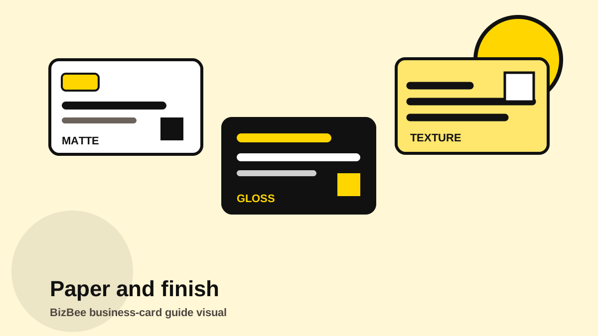
Paper weight: what thickness communicates
Paper weight is a physical brand signal. A very thin card can feel temporary. A mid-weight card can feel practical and professional. A heavier card can feel more established, especially for consultants, brokers, founders and premium services.
But heavier is not always smarter. If cards are handed out in high volume by staff, a practical stock can make more sense than a luxury stock. If the card needs to be written on, surface finish may matter more than thickness.
For Dubai businesses, think about where the card will live: wallets, reception counters, outdoor events, car dashboards, salon desks, cafe counters or trade-show tables. The environment should shape the material decision.
Matte finish: readable and professional
Matte is usually the safest finish when readability matters. It reduces glare, feels calm and works well for cards with small text, QR codes, Arabic/English layouts and professional service brands.
A matte card can still feel premium if the stock is good and the layout is confident. It does not need to look boring. Strong typography, spacing and contrast can make a matte card feel more expensive than a crowded glossy card.
Choose matte when customers need to read details quickly, when the card uses a restrained brand palette or when the business wants trust before excitement.
Readable typography is especially important on matte professional cards.
Gloss finish: colour and image impact
Gloss can make colour feel stronger and photography feel more vivid. It can work for food, retail, beauty, events and brands where visual energy matters.
The tradeoff is glare and writeability. Gloss may make tiny text harder to read under strong light, and it is usually not ideal when customers need to write appointment times or notes on the card.
Use gloss intentionally: menu QR cards, colourful retail cards, promotional cards or image-led brands. Avoid gloss when the card needs a quiet premium feel or frequent handwritten notes.
Industry context helps decide whether colour impact matters.
Writable, recycled and practical stock
Some cards need function more than shine. Appointment cards, loyalty cards, referral cards and service reminder cards may need a writable surface. In those cases, matte, uncoated or textured stock can be more useful than coated gloss.
Recycled or natural-feeling stock can support sustainability positioning, handmade brands, wellness businesses or community-led services. The design still needs enough contrast because natural stock can change how colours appear.
Practical stock is not a downgrade. If the card is clear, useful and aligned with the business, it can outperform an expensive card that does not support the customer's next action.
Appointment and loyalty cards often need writable surfaces.
How to choose without overpaying
Start with three questions: who receives the card, what should they do next and how long should the card last? Then choose the least complicated material that supports those answers.
If the customer will scan a QR code immediately, readability and placement may matter more than finish. If the customer will keep the card for months, durability and feel matter more. If the card represents a premium relationship, tactile quality may be worth the extra cost.
Ask for advice with the artwork attached. Finish recommendations are more accurate when the print team can see colour coverage, text size, QR placement and whether the design expects edge-to-edge colour.
Build the quote request around the card's actual job.
Visual proof
Material comparison visual
Use one fictional card design across several finishes so the difference is about material, not layout.
Paper and finish selector
- - Everyday staff cards: standard or mid-weight matte.
- - Premium introductions: heavier stock, soft-touch or textured finish.
- - Colour-heavy cards: gloss or coated stock, if readability holds.
- - Appointment cards: writable matte or uncoated surface.
- - Outdoor/high-handling cards: ask about durable material.
- - Eco-conscious brands: recycled or natural stock with strong contrast.
Downloadable aids
Frequently asked questions
Is matte or gloss better for business cards?
Matte is usually better for readability and writable use. Gloss is better when colour or photography impact matters.
Are thicker business cards always better?
No. Thicker cards feel premium, but everyday staff, appointment or high-volume cards may work better on practical stock.
Can I write on finished business cards?
Only some finishes accept handwriting well. Avoid high-gloss or coated finishes if writing on the card is important.
What finish is best for QR-code cards?
Choose a finish that keeps contrast high and glare low, then test the QR code from the final proof.
Ask for finish advice before quoting
Send the artwork and intended use. BizBee can tell you whether standard, premium or durable finishing is the smarter path.
Send a business-card enquiryNext step
Attach the card design and explain how it will be used so BizBee can recommend a practical finish route.
Ask which finish fits your card