Business Cards / 14 min
Best Fonts For Business Cards: What Prints Clearly And Looks Professional
Choose business-card fonts that stay readable after printing, work for Arabic/English layouts, support hierarchy and avoid tiny low-contrast text.
Published / Updated
By BizBee. Factual review: BizBee operations.
Short answer
The best fonts for business cards are readable at small sizes, match the business tone and create a clear hierarchy. Use one strong font family or two compatible fonts, keep essential details large enough to read, avoid thin low-contrast type, and test Arabic and English details at actual card size before approving the PDF.
A business-card font has to survive real life
A font that looks elegant on a large screen can fail on a printed card. Business cards are read quickly, under mixed lighting, while someone is standing, walking, sitting in a car or entering a number into a phone.
The font has two jobs: create the right impression and make the next action effortless. If the phone number, email or QR prompt needs zooming, the design has failed no matter how stylish it looks.
For Dubai cards, bilingual layouts add another challenge. Arabic and English need to feel balanced, and numbers should be easy to copy. Do not approve typography only from a zoomed-in design view.
Information hierarchy decides which text deserves the largest type.
Sans-serif fonts: the safest workhorse
Clean sans-serif fonts are usually the safest choice for names, job titles and contact details because they stay readable at small sizes. They can feel modern, direct and practical.
Use a sans-serif with clear letter shapes, generous spacing and enough weight. Ultra-thin fonts can disappear after printing, especially on textured stock or low-contrast backgrounds.
For most BizBee card briefs, a strong sans-serif family with regular, medium and bold weights will be enough to create hierarchy without clutter.
Paper and finish can change how small type appears.
Serif and display fonts: use with discipline
Serif fonts can feel established, editorial, premium or traditional. They can work for consultants, legal services, real estate, finance, hospitality and luxury services when the layout gives them space.
The danger is using a delicate serif for small phone numbers or email addresses. Keep expressive type for names, business names or short brand statements, and use a clearer companion font for essential contact details.
Display and script fonts should be treated as accents. They can add personality to a boutique brand, but they should not carry the phone number, website or QR instruction.
Industry tone should decide how expressive the font can be.
Create hierarchy before choosing decoration
Business cards need a reading order. The eye should know what to see first, second and third. Usually that means business name or person's name first, role or value statement second, then contact details and action link.
Hierarchy can be built with size, weight, spacing, alignment and colour. You do not need five fonts. In fact, using too many fonts often makes the card feel less premium.
A practical hierarchy for Dubai cards might be: name or brand, service promise, WhatsApp/phone, QR destination and location or branch. The exact order depends on the industry and customer behaviour.
Decide what belongs on the card before styling it.
Arabic and English typography checks
Arabic/English cards need layout, spacing and direction checks. The Arabic text should not feel squeezed into leftover space, and the English text should not dominate by accident.
If phone numbers, names or titles appear in both scripts, check alignment and grouping carefully. Customers should not have to decode which number or title belongs to which person.
For bilingual cards, proof at actual size and ask someone fluent in the relevant language to review spelling and layout. A print team can catch technical issues, but language approval should come from the business.
Use proof approval discipline for bilingual details.
Font-size and contrast mistakes to avoid
The most common mistake is shrinking everything until it fits. A card with too much content forces small type, weak spacing and poor hierarchy. Remove non-essential details before reducing the font size.
Low contrast is the second mistake. Grey text on pale stock, gold text on textured paper or thin white text on bright colour can look premium in a mockup and weak in print.
The third mistake is approving without a physical-size check. If possible, print a rough sample on office paper at actual size. Even a rough sample can reveal that the email is too small or the QR prompt is unclear.
Visual proof
Typography comparison visual
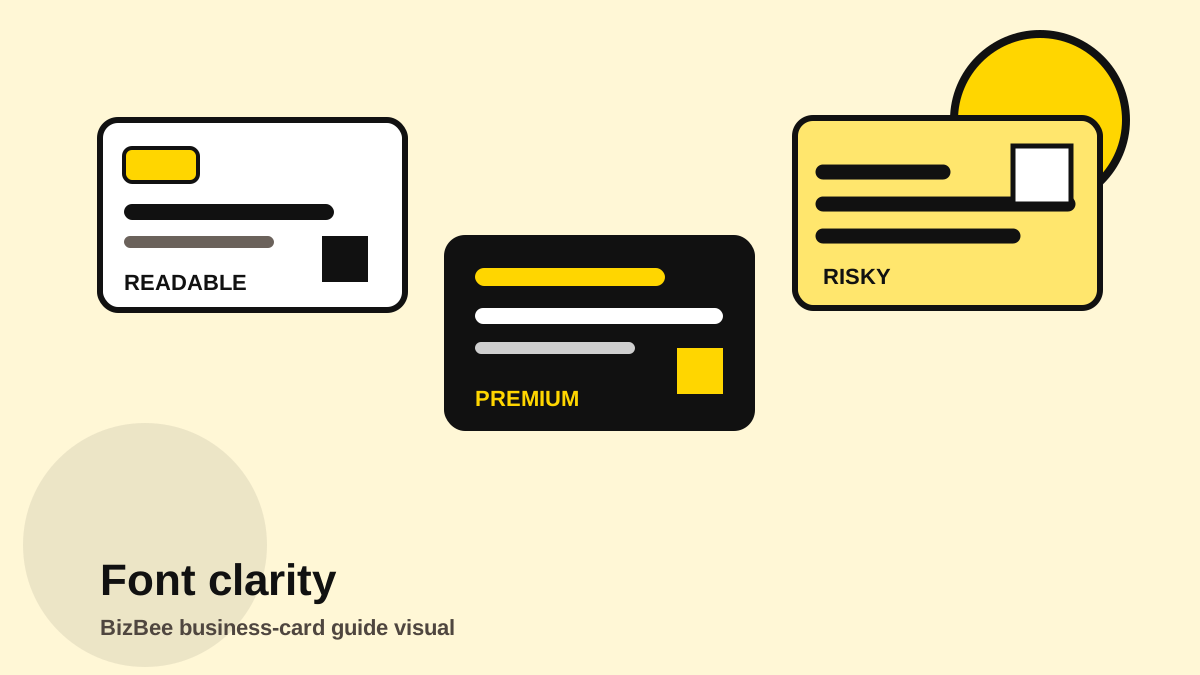
Show the same card with a readable hierarchy, a premium-but-readable hierarchy and a risky low-contrast hierarchy.
Business-card typography checklist
- - Use one family or two compatible fonts.
- - Keep contact details plain and readable.
- - Avoid thin type for small text.
- - Use script/display fonts only as accents.
- - Check Arabic and English at actual size.
- - Test contrast after choosing paper and finish.
Frequently asked questions
What is the best font for business cards?
A clean sans-serif is usually the safest because it stays readable at small sizes. Serif or display fonts can work as accents or for premium brands.
Can I use script fonts on a business card?
Use script fonts only for short accent text, not for phone numbers, emails or important details.
How do I check if my business-card font is too small?
Preview or print the card at actual size and read it without zooming. If essential details feel difficult, simplify the content or increase the size.
Do Arabic and English cards need different font checks?
Yes. Both scripts need separate readability, spacing and proofreading checks before approval.
Send the card for a readability check
If the card looks stylish but you are unsure whether it will print clearly, send the PDF and BizBee can flag obvious type-size risks before quoting.
Send a business-card enquiryNext step
Attach the card PDF and mention the target paper/finish so typography can be reviewed in context.
Ask BizBee to check readability